
The prestige signal shoppers trust first is tactile. Before they read ingredient decks they register weight in palm, varnish drag on thumb, metallised edge catch in studio light. Decoration is not applied last , it is designed first.
If you still treat a perfume body as interchangeable once the liquid is bottled, reconsider: glass painting and kiln silkscreen are how indistinguishable catalog rounds become unmistakably yours. Walk through material choices the way our finishing floor sequences them.
Colour as brand dialect
Most wholesale glass programs start from identical clear shells. Divergence arrives when opacity, gradients, metallics, and soft-touch resins articulate who the product courts. Matte black telegraphs noir intensity; iced glass cues clinical serums without cold sterility.
Contract cosmetics packaging launches hinge on marrying formula stability with emotional palette. Velvet lamination analogue finishes prolong counter engagement long enough for storytelling to convert. The right colour choice is a segmentation decision: a terracotta tinted serum bottle signals natural heritage; a chrome-finished cylinder signals biotech precision.
Glass painting techniques: which one for your brief?
Kiln-fired spray coating is the most durable option. Pigment is applied and baked at high temperature, fusing colour into the glass surface. Alcohol, humidity, and daily handling cannot dislodge it. Luxury cosmetic packaging routinely specifies this technique because the investment reads forever.
Gradient (ombre) painting creates a tonal transition from base to shoulder. Two colours merging in a fluid sweep generate depth that flat labels cannot approximate. This is the technique prestige fragrance houses use to build collection equity across flankers.
Matte and frosted coatings deliver that fingerprint-resistant, tactile calm associated with clinical skincare. The haptic sensation of a soft-touch surface , impossible to achieve with adhesive film , creates a moment of sensory recall every time the consumer reaches for the product.
Metallic mirror finishes , gold, silver, rose gold , are statement choices. A fully metallised perfume bottle competes for visual attention before the shopper reaches the counter. Reserve this for hero SKUs, limited editions, or gifting formats where theatre is the point.
Why pressure labels wilt where silkscreen endures
Labels lift at corners whenever solvent creep attacks adhesive. Perfume concentrates laugh at decals that were qualified on water-based mockups alone. Oven-fired inks migrate into glass microtexture : they shrug at alcohol vapour cycling through daily use.
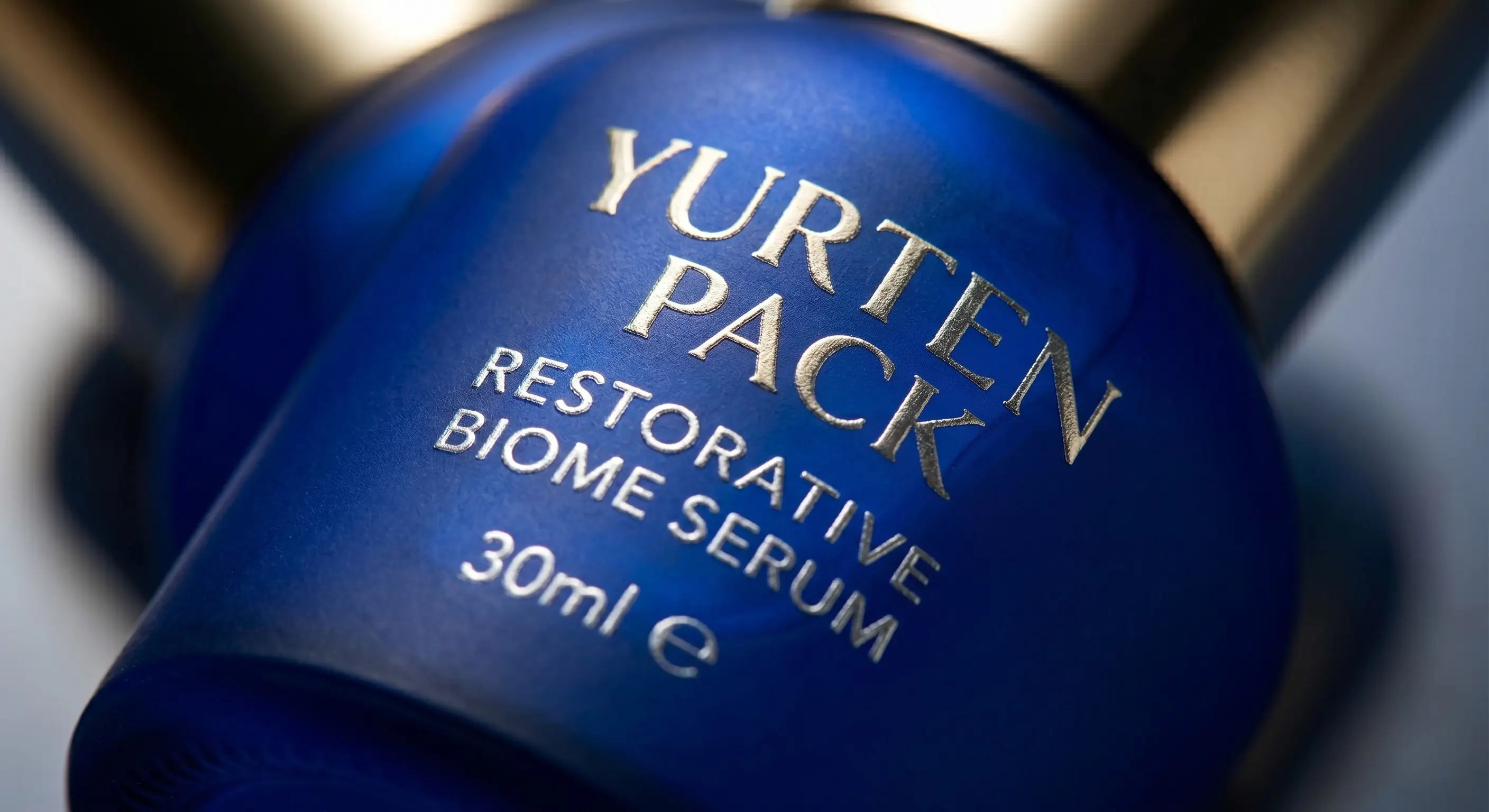
Metallic foils embossed through mesh read bespoke under macro photography : the influencer proof point many launches forget to budget until it is late. A label peeling at the corner costs a brand its credibility in the exact moment a consumer is deciding whether to repurchase.
Decoration services
Ready to see your brand on glass?
Share your brief bottle type, colour direction, and volume and we'll send you technique options with pricing.
Get a Quote → Contact FormThe silkscreen process: what happens in the studio
Understanding the process helps you brief correctly and manage timelines. Each colour requires its own mesh screen , a precisely calibrated stencil through which ink is pressed. Complex multi-colour logos therefore require multiple screen passes, each registered to the previous. This is why early artwork finality matters: changes after screen production restart tooling cost.
After printing, the bottle enters a kiln where temperatures fuse the pigment permanently into the glass surface. No peeling, no scratching through. The firing cycle also completes the bond between any underlying spray-coat layer and the silkscreen overlay, making combined techniques doubly permanent.
Quality control runs piece by piece. Registration drift, ink density variation, and coverage gaps are caught at the station rather than downstream. That labour intensity is precisely why kiln silkscreen commands its price premium , and why brands that use it can credibly charge theirs.
Format-specific cues
Decorate per ritual: airless bottles favour restrained vertical typography so engineering surfaces stay readable. Heavy cream jars absorb opaque lacquer that telegraphs nighttime richness. Acidic serum bottles routinely spec UV-absorbing tints guarding actives between bathroom LED cycles.
Fragrance formats have the widest decoration vocabulary: full body colour, gradient transitions, metallic collars, debossed silk-screen logos on frosted grounds. A clear perfume bottle with a single kiln-applied gold logo can read luxury at a fraction of the cost of custom moulding , and it is that price-to-perceived-value ratio that makes decoration so compelling for emerging brands.
Investment framing, not discretionary spend

Deco amortises via higher realised ASP and lower retail markdown dependency. Consumers literally pay for objet confidence : the collectible bottle they keep rotated toward the vanity mirror. A plain-glass perfume selling at retail for $40 and the identical formula in a kiln-decorated body with a gradient and metallic logo can justify $120 on the same shelf. The decoration delta is perhaps $2 per unit.
Beyond margin, invested decoration signals brand seriousness to wholesale buyers. A decorated sample communicates that the brand has committed beyond a minimum viable product.
"Packaging is not overhead; it is the first tactile promise you physically keep."
Yurtenpack finishing studio
Work with finishing as early as SKU architecture
Brief us while neck finishes are still movable. Harmonising gasket shadow bands, metallised shoulders, or registered multi-hit screens after tooling locks is exponentially pricier. Responsible finishing choices also connect to your packaging end-of-life story; our sustainable packaging guide covers how decoration decisions affect recyclability. If you crave runway differentiation, ping sales through the contact form with references and deco dreams so sampling slots stay ahead of retailer deadlines.